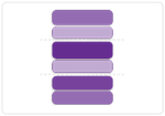
Use this chart to...
- Indicate how far down the backlog a team will get by a specified date.
- Focus stakeholders' attention on the range of functionality between the probable scope and the possible scope lines.
What the chart shows...
- The range of functionality that is likely to be delivered by a date that is specified in the chart settings
- This can be either a specific date or a set x weeks in the future
- Using the historical completion rate (velocity) of the team it is possible to give two key lines
- The probable scope, which is similar to using the pessimistic line in the burn-up chart
- The possible scope, based on the optimistic line in the burn-up
- Using a range like this is a) more truthful and b) better at engaging stakeholders in the necessary (ongoing) discussion about priorities in the backlog

{"serverDuration": 257, "requestCorrelationId": "834fc8851d054347a49234977648c009"}

