...
Use this chart to...
- Engage stakeholders in the backlog by making it more comprehensible and providing them with a business perspective that they recognise.
- Identify work that is in the 'wrong place'
- Review where effort has been spent and where the future focus will be
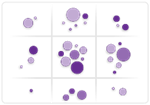
What the chart shows...
- This shows the backlog with the 'Business dimension' (Components or Labels) along the top and the Time dimension (Versions ) down the left hand side.
- Stakeholders can see where the effort went during October and just how many issues were completed for the Membership Launch, in the row above.
Display Options
| Option | Description |
|---|---|
| Show/Hide Title Data | Toggle on/off the table showing search parameters used to create the chart |
| Show Pie Charts / Bubble charts | Show either the items totalled up as a Pie Chart or as individual blobs, representing each item. See example below |
| Y Axis: Show Versions/Labels | Show either Versions or Labels on the Y axis |
| X Axis: Show Components/Labels | Show either Components or Labels on the X axis |
The X axis can be toggled between labels or components
...

