/
Backlog Map
Backlog Map
- Bazil Arden (Unlicensed)
- Jo Haley (Unlicensed)
Owned by Bazil Arden (Unlicensed)
Use this chart to...
- Engage stakeholders in the backlog by making it more comprehensible and providing them with a business perspective that they recognise.
- Identify work that is in the 'wrong place'.
- Review where effort has been spent and where the future focus will be.
What the chart shows...
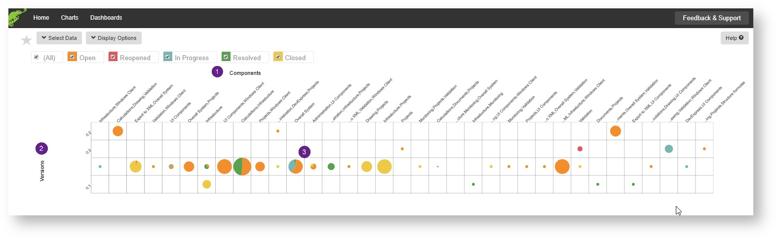
- This shows the backlog with the 'Business dimension' (Components or Labels
 ) along the top and the Time dimension (Versions
  ) down the left hand side.
 - Stakeholders can see where the effort went during October
 and just how many issues were completed for the Membership Launch, in the row above.
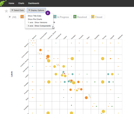
Display Options
| Option | Description |
|---|---|
| Show/Hide Title Data | Toggle on/off the table showing the search parameters used to create the chart. |
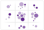
| Show Pie Charts / Bubble charts | Show either the items totalled up as a Pie Chart or as individual blobs, representing each item (see example below). |
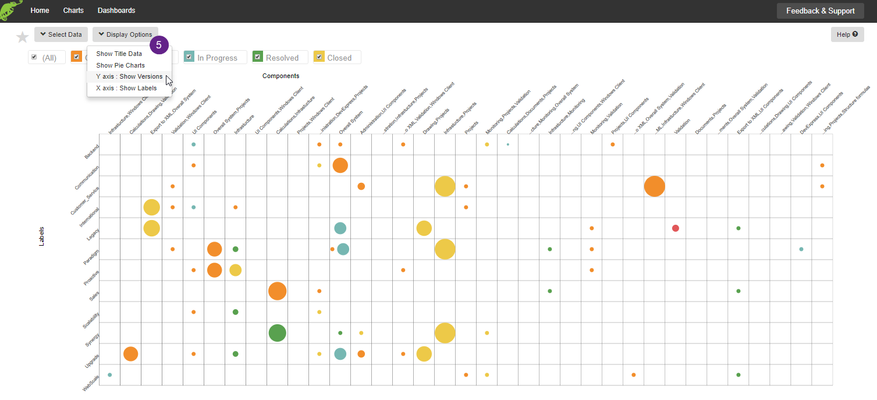
| Y Axis: Show Versions/Labels | Show either Versions or Labels on the Y axis |
| X Axis: Show Components/Labels | Show either Components or Labels on the X axis |
The X axis can be toggled between labels![]() or components
or components![]()
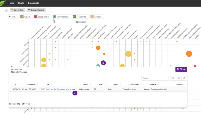
Clicking on a bubble![]() enables you to open the issue in JIRA
enables you to open the issue in JIRA![]()
, multiple selections available,
Related content
Multi-dimensional Backlog
Multi-dimensional Backlog
More like this
Backlog health
Backlog health
More like this
Sense Adapt
Sense Adapt
More like this
Stuck Work
Stuck Work
More like this
Stale work
Stale work
More like this
Potentially Deliverable Scope
Potentially Deliverable Scope
More like this