 Sense Adapt
Data-based, actionable insight
- SenseAdapt provides team-centric visual feedback tools for JIRA.
- The visuals incorporate years of experience working with Agile teams and trying to reclaim metrics from their toxic association with governance.
- Frequent, empirical, visual feedback is at the heart of Agile - it enables teams to sense what is going on in their system and adapt their actions accordingly.
- SenseAdapt aims to heighten the team's awareness of what is happening in their dynamic, un-see-able system.
- Create the chart once at the beginning of the project or phase of work and the chart will continue to provide real-time feedback to any stakeholder.
| Charts | Description |
|---|---|
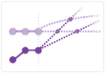
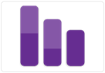
| Burn-upShows the projected end date of projects, based on the throughput rate (velocity) and changes in scope. This is the simplest representation of project progress and easily understood by all stakeholders. It is a significant improvement on just fixating on velocity, as it's just as likely that changes in scope will have a significant influence on the outcome. The chart also shows how much of the change in scope is due to bugs. |
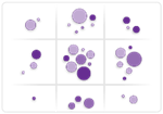
| Backlog MapEngage business stakeholders with an interactive FOUR dimensional view of the backlog. The Y axis represents time (versions) the X axis can toggle between Components or Labels, the colour of the bubble shows the state of the Issue and the size of the bubble relates to the size of the issue. Click on a bubble and open the issue directly in JIRA. |
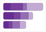
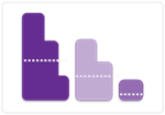
| Epic ProgressShows stakeholders in an easily understood form, the relative size and completeness of Features in the application. The X axis can toggle between total size of the Feature (as a sum of its child issues) or simply as a count of the child issues. Clicking on one of the colour elements on the chart allows users to see the issues within that state and then to open them in JIRA. |
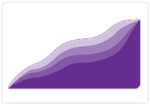
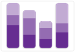
| Cumulative Flow DiagramShows the behaviour of the overall system over time. A information-rich chart which shows a number of things including the rate of incoming vs. completed work, the Work in Progress (WIP) in each state and the approximate lead time for a new piece of work (providing the system is stable). Unlike most CFDs you can look at the WIP in a specific state(s) and see how it changes over time. |
| Stuck workA simple visual that highlights work that the team may have overlooked or forgotten. The visual provides good input to retrospectives. |
| WIP by PersonQuickly see which team member is overloaded and drill in to see more details of the items assigned to them. WIP = Work In Progress |
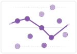
| Sprint BurndownMore than the standard burndown - this shows both the burndown in Stories (normally measured in points) and also burndown in tasks (hours). Users can dig deeper by clicking on the lines and seeing the stories/tasks. |
| Estimate AccuracyHow good is your estimating? This chart shows all the completed stories, their relative size and time it took to get across the 'in progress' states. A good indication of how accurate, or more commonly, inaccurate the estimating is. Good input to retrospectives. |
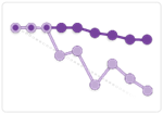
| Scatter Plot (control chart)Shows the lead time distribution of completed issues over time. We provide a log scale to be able to see details of the fast moving items. You can also set the moving mean/median as well as confidence lines. |
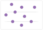
| Issue StalenessShows how long since an issue was last updated. Another simple input to a team retrospective. |
| Requirements ReadinessTeams that estimate their work are in a constant state of refining and identifying the next issues to be sliced down into smaller stories that are 'ready for development'. This visuals highlight the issues that need the team's attention. |
| Backlog healthQuickly see which items are in the wrong version or component and the relative balance of work across different components/versions of the product backlog. Useful when communicating with stakeholders. |