CFD
- Bazil Arden (Unlicensed)
- Jo Haley (Unlicensed)
Use this chart to...
- Visualise the behaviour of the overall system over time.
- Highlight the location of queues or bottlenecks in the system as well as highlighting where there is too much work in progress (WIP).
What the chart shows...
- Looking back it is possible to see where the team had too much WIP, where bottlenecks exist as work flows across the board.
- Advanced techniques can be used to estimate the lead time of work - i.e. how long a piece of work takes to go across the 'in progress' states.
- You can focus on the amount of WIP in a single state, e.g. 'In development' over time. This is useful to see if the trend is in the right direction - where lower WIP is better.
- A lot of insight that can be derived from the CFD. Pawel Brodzinski provides a good summary of how to interpret a CFD.
Select data
Narrow down your search with the Projects, Versions, Sprints, Component and Labels fields.
You will also need to decide which Issue types you want to include in the CFD - this would normally be Stories and Bugs. Issues like features, tasks etc. would NOT be included in a CFD.
Click load to view the chart- enter a name if you wish to save it.
Chart Settings
| Setting | Description |
|---|---|
| Data Interval (days) | Set this to the frequency you want the history to be sampled and the data points appear on the chart. |
| Dates | Select the start date of the chart - the end date will default to 'Today'. Deselect the 'Always Today' check box to enter a specified end date. |
| Hide and Apply Chart settings | This will first do a refresh of the data based on any changes you have made before hiding the data selection panel. |
| Hide | Hides the data selection panel without making a new query to the database. |
Chart Display
| Setting | Description |
|---|---|
| Hide/Show Title Data | Toggles between hiding or showing the title data box. This can be useful if you are copying the image to a presentation and want to see what parameters were set to create the chart. |
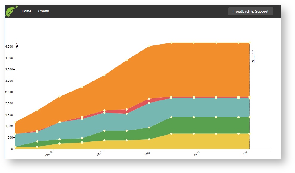
Interpreting the chart
The chart shows the behaviour of the system over time. The columns / states are read from the team's JIRA board. The vertical width of the coloured band shows how many items or effort is held in that band - ideally this should be narrower and parallel. See above for more on how to interpret CFDs.
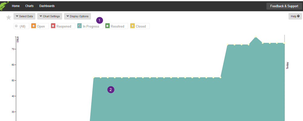
See Work in Progress in a specific state over time
Unlike most CFDs you can choose to look at the WIP (work in progress) in a specific column on the board.
Selecting 'In Progress'![]() we can see an increase in the amount of work in this column on the board. Eventually this reached 70 points of effort
we can see an increase in the amount of work in this column on the board. Eventually this reached 70 points of effort ![]() in that state.
in that state.
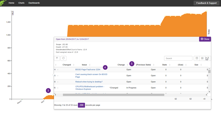
Drill into the details
Click on a data point ![]() on the chart to see the items that are within it. Click on the link
on the chart to see the items that are within it. Click on the link![]() to open it in JIRA.
to open it in JIRA.
Sort the data by clicking on the column header![]()