/
Scatterplot
Scatterplot
- Bazil Arden (Unlicensed)
- Jo Haley (Unlicensed)
Owned by Bazil Arden (Unlicensed)
Use this chart to...
- See if work is flowing across your board more or less quickly than it has been previously.
- Estimate how long it will take for a new piece of work to be finished.
- Provide input to retrospectives, to understand what may have delayed specific issues.
What the chart shows...
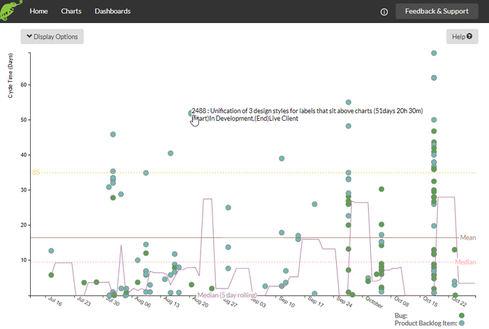
- The cycle times, on the Y axis, show how long a piece of work has taken to go across the 'in progress' states. Teams can identify outliers and use these as an input into team retrospectives or other root cause analysis.
Linear Scale
Scatter plots commonly use a linear scale on the Y Axis.
Logarithmic Scale
Alternatively, data might be easier to see using the logarithmic scale.
You can also clearly see the 85% percentile line and the rolling (15 day) median line.
Details on each item
You can see the exact cycle time by hovering over the blob in the chart.
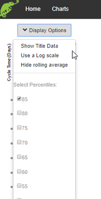
Display Options
- Choose the Percentile lines - showing what proportion of the items have a cycle time of less than say 85%.
- Show/Hide rolling mean/median.
- Show/hide the table of parameters used to create the chart.
Setting up the chart
- Narrow the search with the various parameters indicated.
- Select the date range.
- Decide on a rolling mean or median and the interval (days).
- Choose the 'In Progress' states.
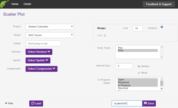
, multiple selections available,
Related content
Requirements Readiness
Requirements Readiness
More like this
PowerBI Help
PowerBI Help
More like this
Backlog health
Backlog health
More like this
Stuck Work
Stuck Work
More like this
Dashboard
Dashboard
More like this
BurnUp
BurnUp
More like this