JIRA / SenseAdapt chart comparison
Use both reporting options.
Different approaches
| JIRA | SenseAdapt | |
|---|---|---|
| Saving charts | Query the data in real time, but not to save the charts for others to use or to ensure the same criteria are used for future queries. | SenseAdapt charts are created once and saved for others to be able to see. On-premise versions of SenseAdapt enable users to click on a single link to see a saved report |
| Actionable | It's not possible to drill through to underlying issues | Click through a chart to see or edit the issue |
| Interactivity | Once created the charts are static pictures, with some hover-over capability | Information shown by the charts can be changed from within the chart, by any user |
| Query data | Many options are available for different charts | |
| Forecasting | Forecasts on burnups are shown, although it doesn't show ranges of forecasts | Forecasting based on user defined confidence levels based on history of the project |
| Number of clicks to information | A typical | |
| Custom colours | SenseAdapt can adopt the colours of your corporate environment - a bit like a chameleon. We think this is important to encourage wider adoption |
JIRA charts and the SenseAdapt equivalent
There are JIRA
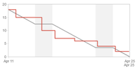
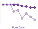
Sprint Burndown
|
| The SenseAdapt burndown shows both the task burndown (in hours) and the story burndown (in points) |
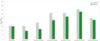
Velocity Chart
|
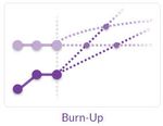
| SenseAdapt does not have a velocity chart - or a chart that shows both committed vs completed work in a sprint. However, we also don't think it's a good idea to focus stakeholders' attention on Velocity - as it can lead to dysfunctional behaviour e.g. inflating estimates or increasing velocity to the detriment of quality. The burn-up chart shows 'cumulative velocity' and projects forward. For more on the danger of velocity fixation see: The power of two lines http://bit.ly/OnTrack2 |
Release Burndown
|
| Burn-ups show the progress and projected outcomes more clearly than a burndown. In particular it is far simpler to see the increase in scope. SenseAdapt also shows what proportion of that increase in scope is due to bugs |
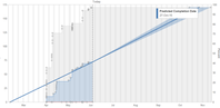
Version Report
|
| Create a burn-up for the version. Users can determine how much history and what confidence levels to use in the forecasting of BOTH scope and of throughput. The JIRA version assumes scope will not change.. which is highly unlikely |
Epic Burndown
|
| Burn-ups can be created at an epic level - and are better at showing the likely range of completion dates. |
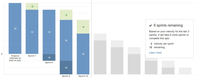
Epic Report
|
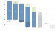
| SenseAdapt Epic Progress shows the relative size and completeness of Epics. Size can be toggled between effort and count. Filter by state e.g. to focus on remaining work, or work in progress |
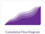
|
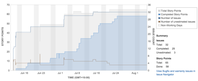
| The SenseAdapt version of the CFD enables you to focus on one or more states on the board. This usefully expands the depth of the band to see trends in details. Clicking on the blobs will show the issues that are in that state on a given date. |
|
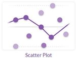
| The SenseAdapt Scatterplot can toggle between linear and logarithmic Y axis - which we have found useful to focus on the items that fly across the board. It also shows confidence lines, chosen by the user. The rolling average can be set to median or mean with a varied interval. The JIRA version has the useful standard deviation shading |
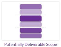
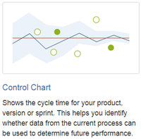
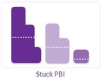
| No direct equivalent | ||
|
| We have taken a different approach with |
|
| |
|
| |
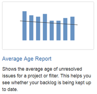
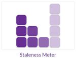

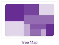
No SenseAdapt equivalent
|
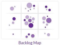
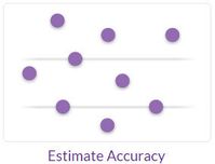
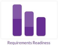
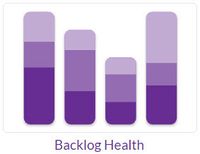
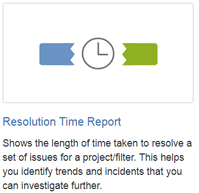
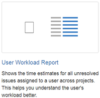
No JIRA equivalent to SenseAdapt charts
Most of the following charts are unique to SenseAdapt - for more details please follow the links to the help pages.
| |
| |
| |
| |
| |
| |
| |